

The business
Pavers Accounting is a boutique UK accounting firm serving sole traders, the self-employed and businesses with revenues up to £10 million. Its services run from company accounts, bookkeeping and VAT returns to corporate tax, tax planning, self-assessment and payroll. The firm, founded by Darius Faiz-Mahdavi, positions itself on reliable delivery, complete transparency and proactive compliance.
The starting point
Darius came to us with an accounting practice to launch and none of the surface a practice needs: no name, no logo, no colours, no website, no copy. Accountancy is a trust business. A new firm competes with established practices from its first conversation, and a generic name or a template website reads as risk to the clients it most needs to win. The brief was the full foundation, starting with what the firm would be called.
What Pellmark delivered
- Naming: the Pavers Accounting name, coined and provided by Pellmark
- Brand identity: logo and colour scheme designed from a blank page
- Website: designed and built from scratch
- Copywriting: every page written by Pellmark, refined after Darius’s review
- Delivery: a one-off build, handed over complete at launch for the firm to run in-house
The work in detail
The name. The firm needed a name that could sit comfortably beside practices decades older. We proposed Pavers. It comes from paving: laying the path, putting solid ground under each step a business takes. For an accounting firm the metaphor does its work without explanation, and the name is short, easy to say, easy to spell and easy to find. Darius took it, and the firm trades under it today.
The mark. With the name settled, the mark had a clear job: carry the metaphor without illustrating it. It is drawn as a path in perspective, slabs fanning out from a single point and widening as they come forward, so the shape reads as ground being laid and as a road opening at the same time. A check mark sits at the crown, which is the one symbol every client of an accountant already understands: filed, checked, correct. The two ideas resolve into a single silhouette rather than sitting side by side, and because the whole thing is solid shape with no fine detail, it survives being reduced to a favicon or embossed on a letterhead.
The palette. Accountancy has a default palette and it is navy blue. Navy signals the profession, which is useful, and it signals every other firm in the profession, which is not. A new practice adopting it has chosen to look legitimate and identical in one move. We went to teal, close enough to the professional register to be read as serious, far enough from it to be remembered.

- Pavers teal#00AEAFThe mark, fills and buttons. At 2.7:1 on white it is never used for text.
- Graphite#39393AAll running text. 10.4:1 on the page ground.
- Porcelain#F5F3F0Page ground. Warm, so long documents do not glare.
- White#FFFFFFCards and panels, lifted off the warm ground.
The arithmetic set the rules. Teal at 2.7:1 against white cannot legibly carry text at any size, so it was scoped from the start to the mark, to fills and to buttons that put white type on a teal ground rather than teal type on a white one. That constraint is the reason the identity never drifts into teal headings, which is where most brands with a bright primary colour quietly fail their own accessibility standard.
Graphite rather than black carries every word, at 10.4:1 on the page ground, past the strictest threshold with room to spare. And the ground itself is a warm off-white rather than pure white, because an accountant’s website is read in long stretches by people checking whether a service covers their situation. Taking the glare down a step costs nothing and makes the reading easier. White is kept back for cards and panels, so the two whites do the structural work that borders would otherwise have to do.
The typography. Two faces, chosen against the two things an accountancy site has to do: look established, and never be misread.
A geometric sans with wide, near-circular forms, drawn from the painted shopfront signage of a Buenos Aires neighbourhood. That breadth is why it is here: at heading sizes it occupies its line with a settled, unhurried weight, which is the visual quality a firm with no history most needs to borrow. It also holds up in capitals, so the wordmark and the headings come from the same source.
Drawn specifically for screen text, with a tall x-height and letterforms disambiguated on purpose. That last property is the whole reason for the choice on this site. An accounting practice publishes figures, thresholds, deadlines and reference numbers, and a body face where a one can be taken for an l, or a five for an S, is a liability rather than a style preference. Inter separates them by design, and stays legible at the small sizes a fee table or a compliance note ends up using.
The website and the copy. We designed and built the site from scratch and wrote every page. Darius reviewed the draft and we refined the copy where he knew his clients better than we did. The result reads like the firm itself: direct, professional and clear about what is included.
What we measured at handover
This was a one-off build, delivered complete and handed over. The figures below are the state of the site on the day we handed it across, which is the last day it was ours to answer for, and the report is reproduced as it was captured. A perfect score is easy to assert and easy to fake, so the address tested and the date of the run stay on the image. The contrast ratios are a property of the palette itself and can be checked against the hex codes above.
Google PageSpeed Insights, at handover
- 100Performance
- 100Accessibility
- 100Best practices
- 100SEO
Design
- 10.4:1Body text contrast, against a 7:1 AAA threshold
- 2Typefaces, each with a defined role
- 1Name, coined and provided by Pellmark
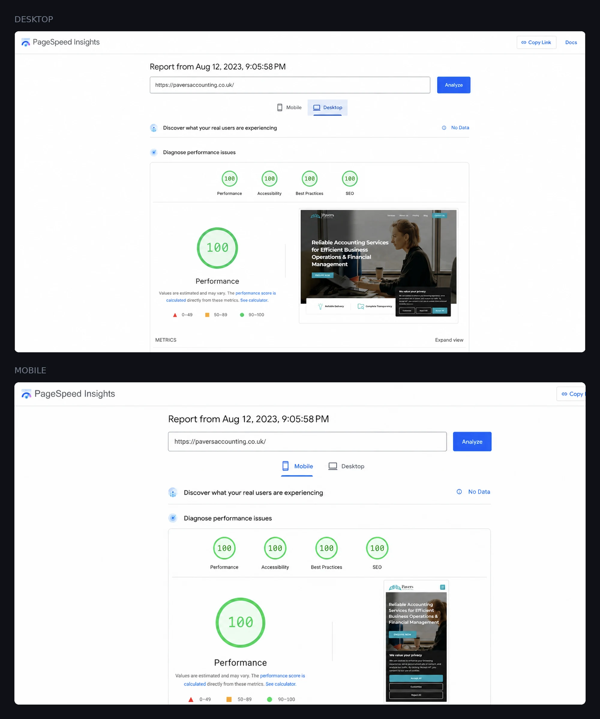
The figures come from the Google PageSpeed Insights run above, published as captured rather than cropped, so the address and the date of the test can be checked against the numbers. Contrast ratios are calculated from the published palette values.
The result
Pavers Accounting launched complete: a name of its own, an identity built around it, and a website with every word written for it. The engagement was a one-off build, delivered at 100 across the board on Google PageSpeed and handed to the firm to run in-house. A firm that did not exist as a brand at the start of the engagement stepped out presenting like an established practice from the first click. Since launch, Darius reports a significant lift in enquiries and in the firm’s visibility to the clients it set out to win.

This case study shows the site as we delivered it. Pavers Accounting has run the site in-house since handover, and a site outside our management naturally changes with time: what is live today may differ from what is shown here, and the figures above describe the site as handed over, not as it stands now.
On commercial results. Every figure on this page is one we measured ourselves. Enquiry volume and revenue sit inside the client’s business, not ours, so we do not estimate them and we will not publish a number a client has not approved word for word. What this page carries is what the instruments showed at handover and what Darius has told us directly, and nothing else.