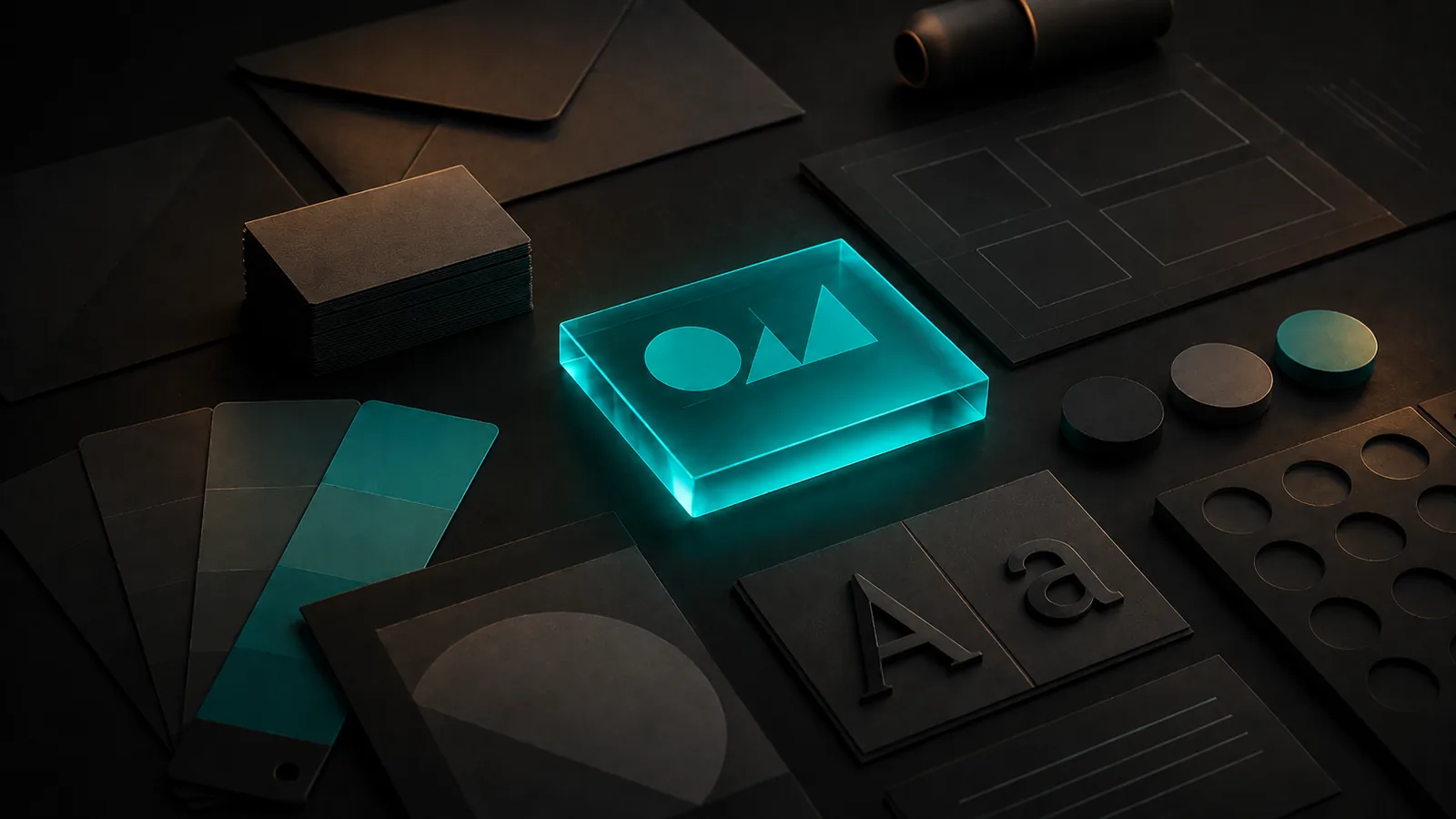
A logo is not a brand.
It is part of one, but if your logo looks polished while your website uses four different fonts, your Instagram graphics have a different colour palette and your proposals look like they belong to another company, the logo is not doing much for you.
Good branding is really about consistency. Someone should be able to move from your website to your social media, an email, a proposal or a printed leaflet and feel like they are dealing with the same business.
For a small business, that does not mean commissioning a 70-page brand manual or spending thousands before you have made your first sale. You just need enough of a system that the business looks deliberate rather than improvised.
Here is what that actually means.
Start with what your brand needs to communicate
Before choosing colours or fonts, work out what you want people to understand about the business.
A family solicitor, independent coffee shop and luxury aesthetics clinic might all want to look professional, but professional means something different in each case.
Ask yourself:
- Who are we trying to attract?
- What should someone feel when they come across us?
- Are we trying to look established, approachable, premium, technical, energetic or something else?
- What would look completely wrong for this business?
You do not need a complicated brand strategy exercise to answer those questions.
But you do need an answer.
Without one, branding tends to become a collection of things the owner personally likes. A font from one website. A colour from another. A logo designed three years ago. A social template someone made in Canva.
Each piece might be perfectly good on its own. Together, they often do not say anything clearly.
Your logo matters, but less than you think
Small businesses can spend a disproportionate amount of time worrying about their logo.
It matters. It should be recognisable, legible and suitable for the business. It also needs to work at different sizes and against the backgrounds where you actually use it.
But it does not need to explain the entire company.
Some of the strongest business identities use extremely simple wordmarks. What makes them feel like a brand is everything around the logo being consistent.
If you already have a perfectly usable logo, you may not need a redesign at all. Sometimes the better investment is simply deciding how it should be used and building a stronger visual system around it.
That includes things like spacing, placement, background colours and deciding which version appears in which situation.
A good logo used badly still looks bad.
Choose a colour palette, not just a colour
Most businesses have a colour.
Far fewer have a colour system.
If your brand colour is blue, that still leaves a lot of unanswered questions. Which blue? What sits behind it? What colour is the text? What happens when you need a lighter section? What colour should a button be? What do you use for something that needs attention?
A useful small-business palette does not need to be complicated. Usually you need:
- A primary brand colour.
- One or two supporting colours.
- A dark colour for text and contrast.
- A light or neutral background.
- Clear rules for how those colours are combined.
The point is not to create more options. It is to remove decisions.
If the palette is already defined, whoever makes the next social post, presentation or page on the website does not have to choose a slightly different shade every time.
That is how consistency starts.
Pick your typography and stick to it
Fonts have much more influence on how a business feels than most people realise.
A traditional serif can make a brand feel established or editorial. A clean sans serif might feel more modern and direct. Something highly stylised can add personality, but can quickly become difficult to read.
For most small businesses, two typefaces are plenty.
You might use one for headings and another for body copy, or use one flexible font family throughout with different weights.
What matters is that the choice is intentional and repeatable.
Once you have chosen it, use it consistently across the website, social graphics, documents and marketing material wherever practical.
Five different fonts do not make a business look more creative. They normally make it look unfinished.
Decide what your imagery should look like
This is one of the most overlooked parts of branding.
Two companies can use the same logo, colours and typography and still feel completely different because of the photography and imagery around them.
Think about what belongs in your world.
Do you use bright natural photography or dark, controlled imagery? People or products? Close-ups or wide shots? Illustrations or photography? Highly polished studio images or something more candid?
There is no universally correct answer.
The important part is making a decision rather than choosing images individually every time you need one.
This matters particularly on websites. A well-designed page can lose its entire visual identity if every section uses stock photography in a different style.
Your words are part of the brand too
Branding is often treated as purely visual, but people experience your business through language as well.
Compare:
“Please submit an enquiry and a member of our team will respond.”
with:
“Tell us what you need and we’ll come back to you.”
Neither is automatically better. They simply create a different impression.
Decide whether your business sounds formal or conversational, restrained or energetic, technical or plain-speaking.
Then carry that tone across your website, emails, social media and customer communications.
The easiest way to make a business feel bigger and more established is not necessarily to make it sound more corporate. It is to make it sound consistent.
Consistency is what makes branding work
This is the part that matters most.
A customer may see your business several times before they contact you.
They might discover you on Google, visit your website, see an Instagram post a week later and eventually return after someone recommends you.
Those interactions should reinforce each other.
You do not want them wondering whether the Instagram account belongs to the same company as the website.
That does not mean everything needs to look identical. It means the same basic visual language should run through it all: the colours, typography, imagery, logo treatment and tone.
A relatively simple identity used consistently will usually look more professional than an elaborate identity used inconsistently.
What you probably do not need
Branding can become expensive very quickly because there is almost no limit to how far you can take it.
Large companies may genuinely need extensive brand architecture, research, multiple sub-brands, detailed guidelines and hundreds of possible applications.
Most small businesses do not.
You probably do not need dozens of logo variations, an enormous brand manual, a bespoke typeface or a months-long branding process before you can launch.
You need the foundations done properly.
That usually means a clear logo or wordmark, a defined colour palette, typography, visual direction, imagery style and some basic rules for how everything is used.
You can always expand the system as the business grows.
When DIY branding is enough
Doing it yourself can be perfectly sensible, particularly when you are testing an idea or working with a very limited budget.
If you are still figuring out what the business is, spending heavily on a full identity before the proposition is settled rarely makes sense.
Start simple.
Choose a restrained palette. Pick one or two good typefaces. Use the same logo everywhere. Keep your imagery consistent. Build a few reusable templates.
The point at which professional help becomes more valuable is usually when the business itself has moved ahead of the way it looks.
Perhaps you have good clients and strong work, but your website still feels like something you made when the company started. Or every document, social post and page looks slightly different because nobody ever established the rules.
That gap matters because new customers cannot see the quality of the work you have already done. They can only judge what is in front of them.
A simple branding checklist
If you run a small business, you should be able to answer each of these without having to think about it:
- What is the correct version of our logo?
- Which colours do we use, including the exact colour codes?
- Which fonts do we use for headings and body text?
- What should our photography or imagery look like?
- How should the logo appear on light and dark backgrounds?
- What should our business sound like when we write?
- Do our website, social media and marketing materials clearly look like the same company?
- Could someone else create something for the business without having to guess how it should look?
If you cannot answer several of those, you probably do not need a complete rebrand.
You need brand foundations.
Where to start
Do not begin by throwing away everything you already have.
Look at your current logo, website, colours, social profiles and marketing materials. Work out what is already doing its job and where the inconsistency starts.
Then define the missing pieces and use them everywhere.
At Pellmark, that is how we approach brand foundations. We establish the colour palette, typography, visual direction, logo usage and overall visual language needed to make the business feel consistent and considered.
If we are building your website, those foundations are developed as part of the build. If you already have a website and simply need the brand itself brought together, Brand Foundations is also available as a standalone project.
The aim is not to make a small business look like a multinational.
It is to make it look like the business it already is.